

Thursday 6th July 2023
Difficulty: Very easy
Waitrose's product labelling (#230)
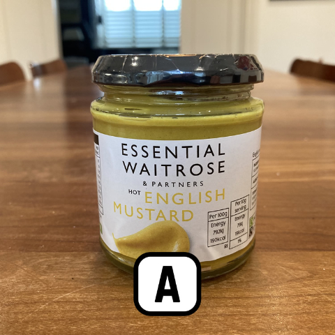
Waitrose was given a "brand refresh" in 2022 by the design agency Pentagram. As part of the design, the "essentials" product lines had their labelling redesigned. This has attracted criticism, especially from older people, because of its non-adherence to best principles for legibility in design.
1. Waitrose's product labelling has been criticised because it fails to follow good practice for legibility. How many of the following aspects of its labelling cause problems, especially for older people or those with less than perfect vision?
- Product name written in all capitals
- Poor colour contrast between the product name and the background
- Text is not aligned in any normal way
- In many cases, pictures distract the reader from the text
- Greater emphasis given to the "ESSENTIAL WAITROSE & PARTNERS" text than the product name
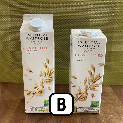
2. The two 1 litre packs of Waitrose "Oat Unsweetened" above (see Slide B) look identical, but are actually different. One is priced at £1.50, while the other costs £1.30. The label gives no clues as to how they differ. What is the difference?
3. As noted above, Waitrose labels have several features that make it harder for older people to read them. According to The Grocer magazine, in what sort of area are Waitrose stores typically located?
Privacy: we believe in respecting our users' privacy. When you click the button above, you'll get your score straight away. We won't request your details, or try to sell you anything, or ask you to subscribe.